Veltliner Winery
Winery branding

About us
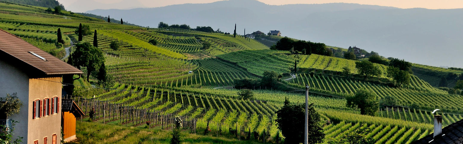
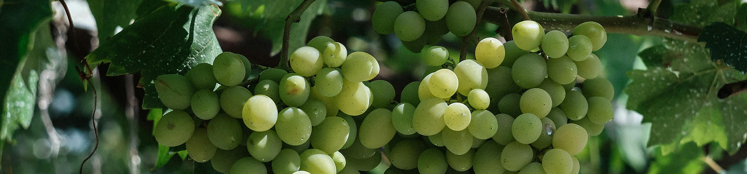
Founded in 1987 in the heart of Austria’s Wachau Valley, Veltliner Winery is a family-owned vineyard that bridges traditional Austrian winemaking with a clean, modern design approach. Nestled between rolling green hills , the winery produces elegant white wines that embody the essence of the region’s signature grape - Grüner Veltliner.
The brand reflects a harmony between nature, balance, and aesthetics, and a deep connection to the land.
The name given to the winery, “Veltliner,” originates from the name of a green grape variety commonly grown in Austria, from which the wine itself is also produced.

Target Audience
Veltliner Winery speaks to modern wine lovers who value authenticity, simplicity, and refined taste. They appreciate nature, design, and balance, seeking a calm yet elegant experience in every glass.
Brand goals
Veltliner Winery aims to blend tradition, nature, and modern elegance.
Its goal is to craft authentic, high-quality wines that reflect Austrian heritage while offering a refined and balanced experience through thoughtful design.
Visual Language
The visual identity of Veltliner Winery expresses a refined connection between nature, tradition, and modern design. Through a harmonious palette of muted greens, beige, and warm neutrals, the brand evokes authenticity, calmness, and understated luxury.
The use of clean sans-serif typography combined with soft cursive elements creates a modern yet welcoming feel. This visual style reflects both the brand’s craftsmanship and its elegant, contemporary character, conveying balance, tradition, and the calm beauty of the Austrian vineyards.
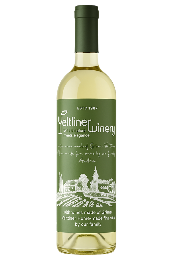
Bottle design
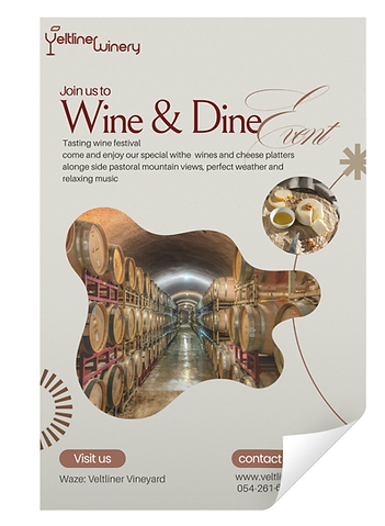
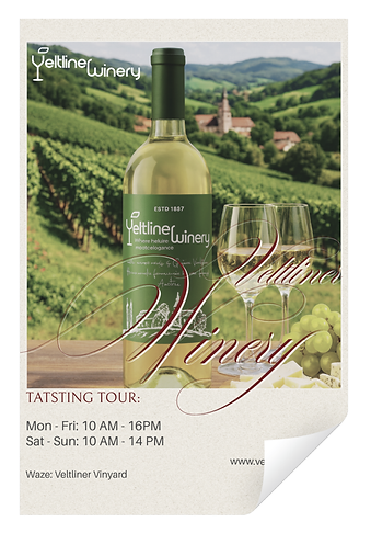
The flyers designs express a refined and elegant visual language through the use of olive green and deep burgundy tones that evoke warmth and sophistication. The combination of modern sans-serif typography with classic script elements creates a balance between tradition and contemporary style.

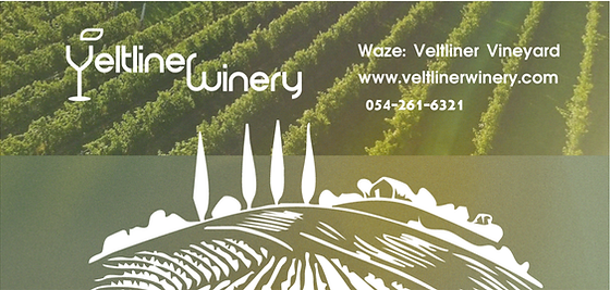
Veltliners website
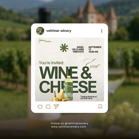
Social media
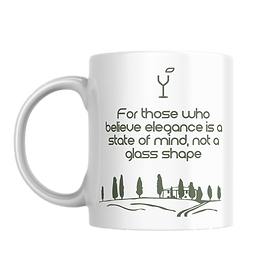
Gift your loved ones
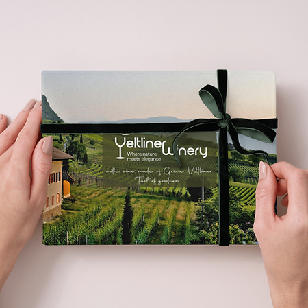
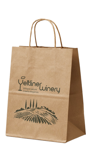
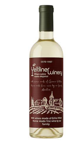
The packaging of Veltliner Winery communicates nature and elegance through a refined minimalist design approach.
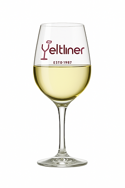
Each wine bottle is expressed in a subtle color palette, while the signature dark green cap remains constant - symbolizing the brand’s strong connection to nature and its authentic roots.
The brand offers a selection of thoughtful souvenirs - such as mugss - perfect for gifting to loved ones or anyone with a true passion for wine.
Together, these elements create a memorable brand experience.
You’re more than welcome to visit at the winery
Business card
Brand values
Elegance – expressing sophistication through simplicity and purity
Balance – creating calm, unity, and natural refinement across all brand elements
Authenticity – staying true to the land, the process, and the winery’s Austrian roots
Logo + Concept Analysis
The main logo

Logo with tag-line

Logo font: Electromagnetic Lungs
Logo color: #798761
Tag line font: CoFo Sans VF
Secondary logo

Veltliner Winery logo symbolizes the harmony between nature and craftsmanship.
The wine glass shaped as a “v” with a leaf represents growth, balance, and refinement.
Minimal lines and the sage olive green (#798761) color convey elegance, calm, and authenticity - expressing the winery’s essence in a simple, timeless form.
The tagline “Where nature meets elegance” captures the essence of Veltliner Winery - a meeting point between organic beauty and refined design.
It reflects the brand’s simplicity and harmony, connecting the winery’s natural origins with its modern, elegant identity.
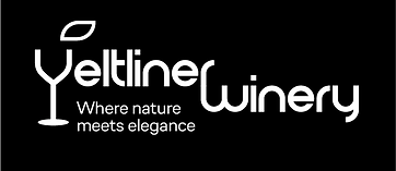
Logo - white on black
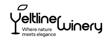
Logo - black on white
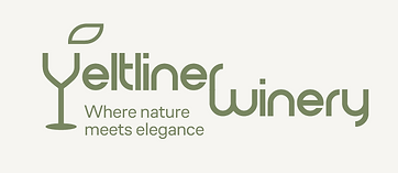
Logo - olive green #798761
on beige #f6f5f1
Logo Concept Analysis
Typography- Using CoFo Sans, a geometric and elegant typeface, the logo conveys sophistication and clarity. The rounded forms bring warmth, supporting the brand’s natural and welcoming character.
Color Palette- The new sage olive green represents the tones of vine leaves and Austrian landscapes. It feels calm, organic, and refined, perfectly linking the design to nature while maintaining a timeless look.
Composition - The structure creates a clean visual balance between the symbol, text, and tagline. The proportions and spacing emphasize simplicity and elegance while keeping the focus on the central wine-glass mark.
Overall Impression - Minimal, elegant, and rooted in nature - the logo captures "Veltliner Winery’s" essence: a seamless blend of craft, calmness, and natural sophistication.