Barkery- bakery branding
Barkery was born from a love for two of life’s simplest, purest joys:
the smell of warm dough and the calming presence of a happy dog.
It’s a place where time slows down,
and life feels a little more real.
A small bakery-café where everyone, on two legs or four, can find a moment of peace, a warm cup of coffee, and good company.
The place is built on a simple idea:
to share sweet moments with the ones we love.
To indulge in nostalgic, freshly baked pastries and simply enjoy the moment, together.
Logo + Concept Analysis
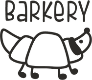
The main logo

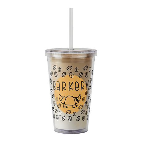
The name "Barkery" comes from a playful blend of "Bark" and "Bakery"
Secondary logo
"Our Recipe for Happiness" expresses Barkery’s belief that true joy is made from simple ingredients - warmth, community, and good company (with wagging tails).
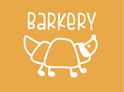
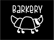
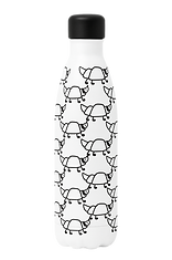
Functional Flexibility Works perfectly in black and white, small or large scale, print or digital. A logo built for versatility, ready for packaging, animation, and signage.
Logo font: Fishfingers, with little touches
Logo color: #2d2b28
Tag line font: CoffeCake
Logo Concept Analysis
Balanced Composition:
The logo maintains perfect visual balance between the illustration and the typography.
The eye flows naturally between both elements, creating a calm, harmonious rhythm.
Consistent Line Language
A unified line-art system: confident yet soft.
The line weight matches the brand’s tone — clean, modern, and handmade.
Typography
A rounded sans-serif typeface complements the illustration.
It feels hand-written, modern, warm, and human — supporting the story rather than competing with it.
Soft, Effortless Identity
The character feels alive, friendly, and approachable.
It’s witty but never childish, minimal but rich in emotion - a true reflection of Barkery’s heart.
Icon with Character
The croissant-dog character is memorable and full of life.
It’s not just a logo - it’s a warm, lovable character for the brand.

Brand Goals
Target audience
- To create a genuine sense of home and community.
- To express warmth, authenticity, and love -for both people and their pets.
- To show that design can be simple, natural and deeply human.
- To distinguish Barkery from commercial spaces - shaping it into a brand with heart.
- People who enjoy a good pastry and coffee at any time of day.
- Dog lovers and dog owners of all kinds.
- Those who seeking a quiet moment away from the city's noise - surrounded by comforting aromas and flavors of baked dough.


Brand values
Warmth- Because every story begins with warmth - in the oven, and in the heart.
Community- A cozy place where everyone belongs. Built on kindness and conversation.
Creativity – Mixing tradition with a playful twist.
Visual Language
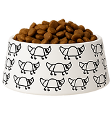
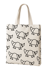
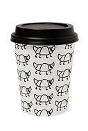
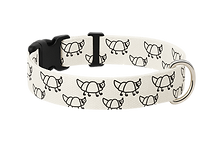
The concept behind the visual language was to create a hand-drawn, sketch-like aesthetic - as if illustrated with a black marker on paper.
A touch of warm orange, playful icons, and real-life details were added to make the black and white feel more alive.
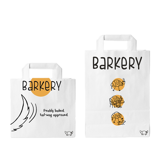
Paper bag design
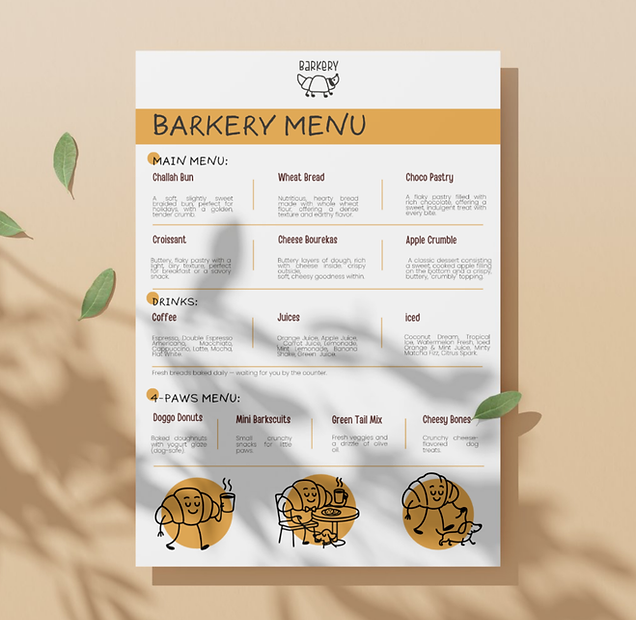
Menu
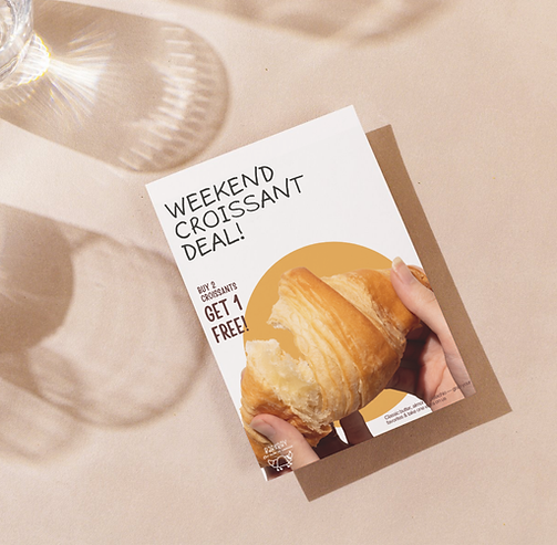
Flyer
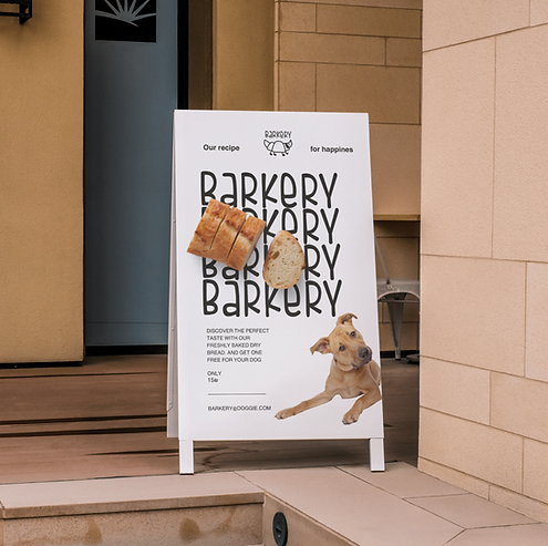
Sign
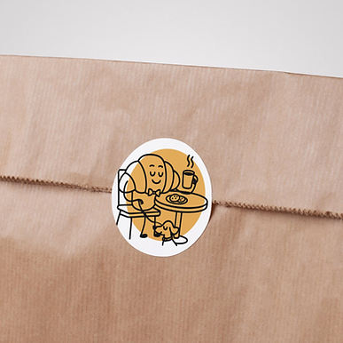
Sticker
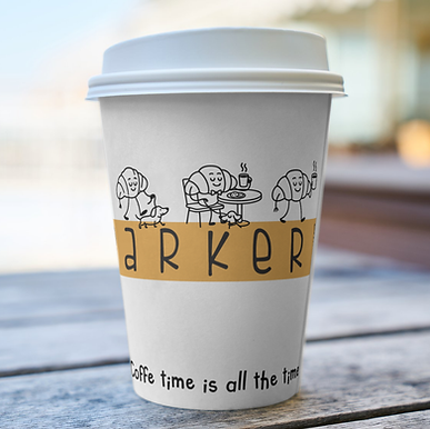
Paper cup
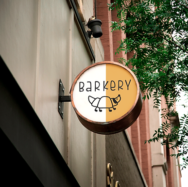
Signboard
Icons
.png)
Fonts
Helvetica world
Six hands marker
Handy casual
Colors
#161616

#eaa949
#5b2d29:
The goal
keep the design language light-hearted and approachable rather than formal or heavy.
After all, this is a cozy bakery-café- a place that feels like home and evokes childhood nostalgia through both flavor and imagery, reminiscent of marker doodles on walls and paper.
Barkery is a playful bakery-café And of course, it wouldn’t be complete without our best friends on four legs- because who wouldn’t want to bring their favorite companion to such a welcoming spot?