
View the brand book

Beyond - Ruby chocolate branding
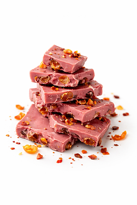
BEYOND is a unique ruby pink chocolate created to break everything you thought you knew about “sweet.” Blending unexpected ingredients like chili flakes, dried orange, and pistachios, it delivers a bold, addictive, and mature flavor experience that feels both playful and premium. This isn’t an ordinary chocolate bar - it’s a sensual twist on indulgence, designed to take you beyond the expected, beyond the familiar, and beyond sweet.

Brand goals
Target audience
To redefine pink (ruby) chocolate as a bold, grown-up indulgence. To create a destination for chocolate lovers who value luxury, creativity, and lifestyle. And to build a premium brand that blends aesthetics, flavor, and emotion into one unforgettable experience.
- Adults aged 22-45 who appreciate premium and high quality
- Gift buyers & lifestyle consumers
- Romantic and experience - driven couples
- Chocolate lovers
Logo + Concept Analysis
The main logo

Secondary logo

Black on white

Withe on black

Logo font: TypoGraphica
Logo colors:
#e46668
#2d2427
#2f4f56
Tag line font: TypoGraphica
Concept Analysis

Colors
The color palette blends deep ruby pink with dark teal and black, creating a look that feels luxurious, edgy, and unexpected.
The contrast between warm and cool tones reflects the brand personality: bold, grown-up, and unapologetically different.
Logo Name – “BEYOND”
The name BEYOND communicates a brand that goes further than the ordinary - beyond classic sweet, beyond expectations, beyond the predictable.
It positions the chocolate as a statement: creative, premium, rebellious, and modern.
Icon
This visual element reinforces the brand’s core promise: surprising, provocative, and instantly recognizable.
Slogan - “if sweet was a lie.”
The slogan delivers a clever, cheeky twist - suggesting this chocolate is not “sweet and innocent,” but bold and complex.
It creates tension between what you expect and what you actually get: pink doesn’t mean predictable.

Visual language


Beyond's graphic visual language is built on bold color contrast, combining deep dark tones with vibrant ruby and muted teal accent. The visual system is defined by organic, flowing shapes that create rhythm , movement and emotional depth. Clean, minimal typography balances the expressive patterns, resulting in a cohesive, modern and distinctive visual language.
Brand values

-Quality without compromising
-Sophisticated indulgence
-Modern maturity
Brands typography & Color Palette

