
TOFA'AT TEVA
Website design for association
"Tofa'at teva" -"Because Nature is Home" is an Israeli organization dedicated to rescue, assistance, and love of nature, aimed at helping those who get stranded along the way.
In addition, the organization is involved in nature restoration, search and rescue for missing persons, organizing trips for people with disabilities, arranging excursions for the general public, and other activities that promote the values of nature and love for the environment.
All of this is done entirely on a volunteer basis.
Target Audience
- People interested in joining the organization
- Nature and hiking enthusiasts
- Individuals in need of rescue or assistance
Website Structure
The website contains six pages, along with an additional page designed to help people in need of rescue with quick access to the rescuers’ phone number (in the mobile version, users can call directly).
The website’s pages include “Home,” “Rescue and Off-Road Driving Training,” “Questions and Information,” “Join the Family,” “Contact Us,” and “Gallery.” The website itself is practical and easy to use.

Main page - "Home" on scroll
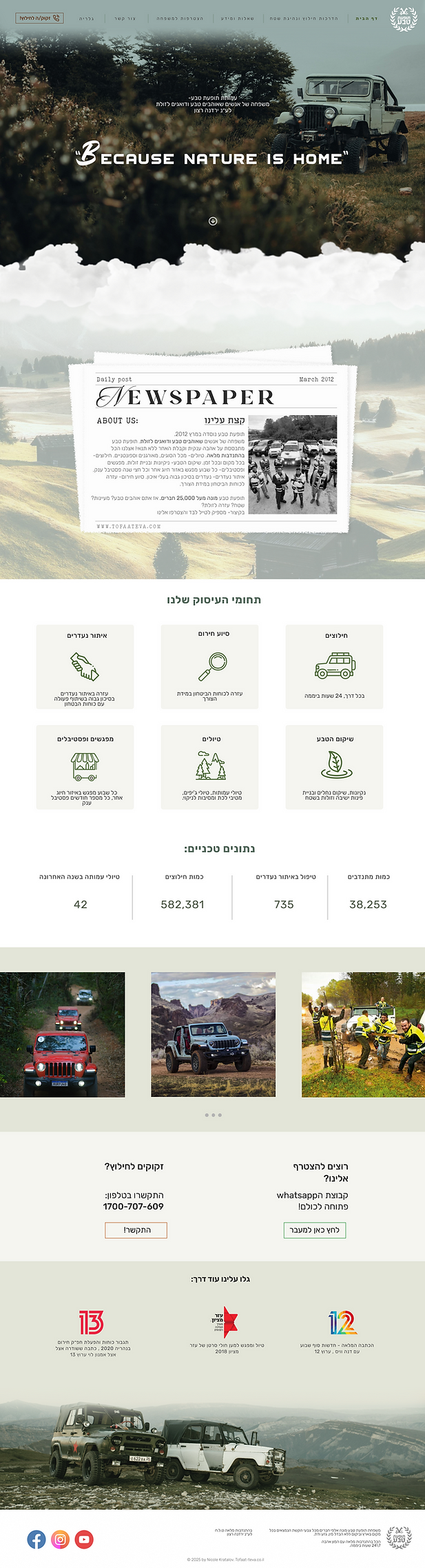
The website header includes the logo and the navigation bar
"Because nature is home"- tag line
About us
Our Fields of Activity
and
Technical Information
Mini gallery
More info
Footer
"Rescue and Off-Road Driving Training" page
The second page presents explanations, guidelines, and information about off-road driving and rescue.

On scroll
Since the page contains a large amount of information, it was designed in a way that prevents cognitive overload for users.
The content is divided into numbered blocks, creating a clear and scannable layout. This structure makes the page feel more spacious, organized, and lightweight, enhancing overall readability and user experience.

"Questions and Information" page


On scroll
The page is relatively simple and serves as a space for questions and information related to the organization.
It features a list of questions, and by clicking on the arrow or the question itself, the corresponding answer or information expands.
This interactive accordion layout provides a clean, intuitive experience that allows users to easily explore topics without overwhelming the interface.
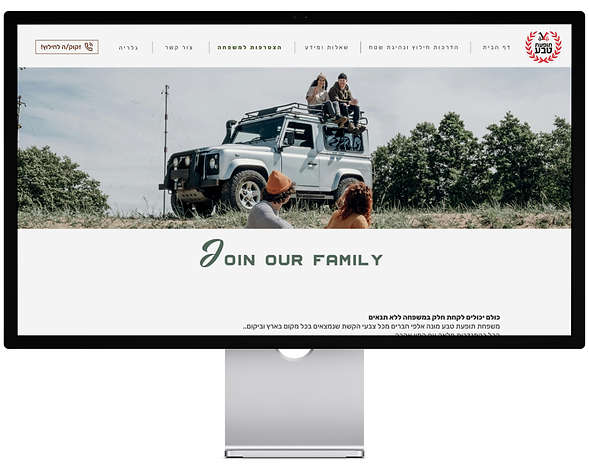
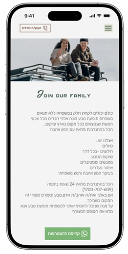
״Join the Family״ page
The page contains details and information about joining the organization’s “family,”
presented in a warm, inviting design that encourages engagement and a sense of belonging.
The page also features a green button that leads directly to the organization’s WhatsApp group, which includes all members and volunteers.
On scroll

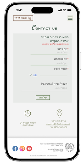
״Contact Us״ page
On this screen, users can leave their contact details, a question, or a specific inquiry of interest.
This page also includes the organization’s operating hours, mail, phone number and location.

״Gallery״ page

The Gallery page showcases a curated collection of images from various scenic and interesting locations across the country.
The design emphasizes visual discovery and smooth navigation - each image acts as an interactive entry point. When users click on a specific image, they are seamlessly directed to a dedicated information page that includes details about the location, directions, and interesting facts.
At the bottom of the page, a horizontal selector allows users to quickly browse and jump to other locations, maintaining an intuitive and engaging visual flow throughout the experience.


Additional Page: "Need Rescue"
The additional page is designed for emergency purposes, providing essential information and - in the mobile version - immediate one-tap access to contact the rescue team.
The page uses strong, high-contrast typography in bold fonts over a dark background, ensuring maximum visibility and readability under stress. This visual hierarchy directs users’ attention to the most critical information, supporting quick decision-making and accessibility in urgent situations.

The website’s design
emphasizes a deep appreciation for nature, hiking, and off-road adventures, while also highlighting the organization’s core value of helping others. The overall aesthetic is elegant and understated, allowing the content and imagery to speak clearly without overwhelming the user.
The site delivers information in a clear, accessible, and intuitive way. With only six main pages, navigation feels lightweight and effortless.
The buttons are large and prominent, and the typography is carefully balanced for optimal readability across devices.
Every design choice - from layout to hierarchy - supports an experience that feels seamless, approachable, and purpose-driven, helping users easily find what they need while connecting emotionally with the organization’s mission.
Mobile
There is also a mobile-optimized version of the website, maintaining the same visual design and user experience across devices.
The layout is fully responsive, adapting seamlessly to smaller screens while preserving readability, navigation flow, and visual hierarchy.
This ensures a consistent and cohesive experience — whether accessed from a desktop, tablet, or smartphone — allowing users to easily engage with the content anytime, anywhere.

Design system
The design work was done in Figma
Fonts & typography
"RUBIK" light,
"RUBIK" regular
"RUBIK" medium
"RUBIK" bold
"Aero Club Como"
Font sizes
size 14 body text
size 24 body text
size 27-25 body text
size 48 sub header
size 75, 60 header
Color palette
#E3E5D8
#F5F5F0
#F4F4F4
#FFFFFF
#648150
Font colors
Header
#51685A
Sub header
#51685A
Body text
Body text
Disabled
#585858
#454545
#828282
Icons